


Not sure which fabric is right for your situation?
- COASTAL for daily mediterranean sun, UV index 8
- PERFORMANCE truly waterproof, for pool areas
- COMFORT for super comfort en premium looks
FAQ about choosing your outdoor fabric and colour
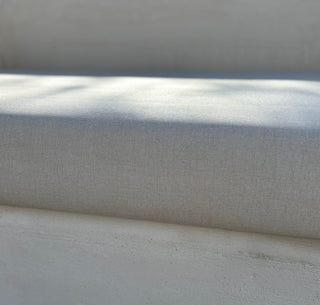
Honestly, not always, and that's exactly why we offer free samples. Screen colors are calibrated for indoor light, and the Spanish sun is an entirely different story. In strong Mediterranean light, warm neutrals like sand, dune and beige tend to look lighter and more luminous than they appear on screen. Deeper tones like terracotta, charcoal and navy read richer and more saturated outdoors. Cool whites even look almost luminescent.
The only reliable way to choose is to hold the actual fabric in the light on your own terrace. Please also check at different timings during the day. Especially the time you tend to use it most. Request a 3 free color samples, leave the swatches outside for a morning and an afternoon, and you'll know immediately which colour works for your space and your taste. That's exactly what the samples are for.
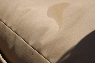
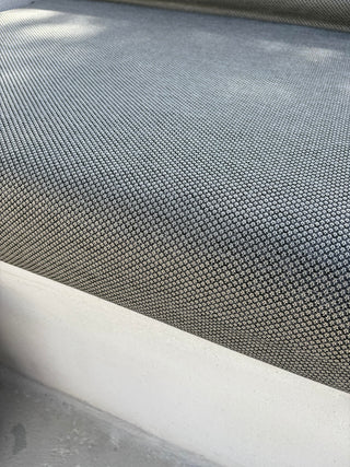
This comes down to two things: the fabric quality and how the colour is applied. In all three of our fabric ranges (Comfort, Coastal Proof and Performance) the colour is solid dyed. This means it runs through every fibre rather than being printed on the surface. That's the single most important factor in long-term colour retention. So in case you chose for a design take care that the lines or flowers are woven in the fabric and not printed.
That said, the intensity of the color matters too. In our experience along the Spanish coast, mid-tones like warm sand, taupe, natural linen and dusty terracotta hold their character the longest. Very dark colors absorb more heat and can subtly shift over years of intense UV exposure. Very light colours, particularly pure white, can develop a slight warm cast over time. Our Nomad Beige, Dune and Salt tones sit in the sweet spot.
All fabrics of Interior Nomad offer a high UV resistance rated UV index 8 and sometimes 7/8. (Nice to know: the highest UV rate is 8.)
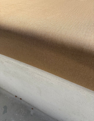
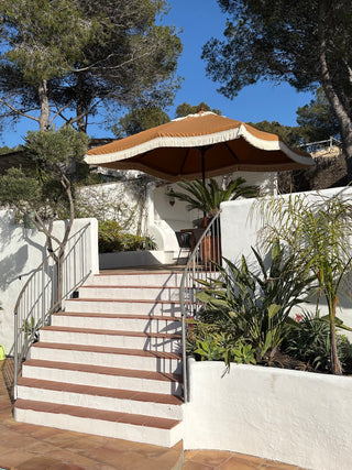
The Spanish coast has a very specific color palette: warm terracotta tiles, whitewashed walls, sandy stone, dark ironwork and the blue of the sea and sky. The good news is that most of our fabric ncolors are designed to sit within this palette rather than compete with it.
A few practical guidelines. If your terrace has warm-toned tiles like terracotta, sandstone or honey-coloured, go for tones in the same family: quiet dune, dusty terracotta, warm beige or linnen. They'll feel connected rather than clashing. If your walls are white or pale, you have more freedom: both warm naturals and slightly cooler tones like linen grey or mint green work well. If you have a pool, consider how the color matches the blue of the water: sandy neutrals create a calm, resort-like atmosphere, while a deeper tone like charcoal or forest adds more contrast and drama.
When in doubt, check the swatch locally and hold it against the main surface; next to floor, wall or frame rather than trying to visualize it in your head.
Yes, and we'd actively encourage it. Because our outdoor cushions, sun lounger cushions and parasols are all made from the same Coastal Proof acrylic fabric, you can order swatches once and match your entire outdoor space in one cohesive look. One fabric, one colour, three products; parasol, sun lounger and lounge cushions that all belong together.
This is one of the things that makes Interior Nomad different from buying a parasol from one supplier and cushions from another: the colour references are the same across the entire collection, so what you see on the swatch is what you get across every product you order.
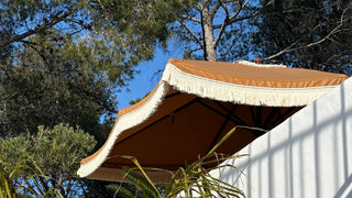
If you're mixing products; for example a Coastal Proof parasol with Performance pool cushions, request swatches from both sub-collections. If you compare them please mind that the fabric of the parasol will be in the air, and check also 'against' the sun. Instead the performance fabric for a poolp proof poof must be check at the solid ground and the sun shining on it. This will make it as real as possible.
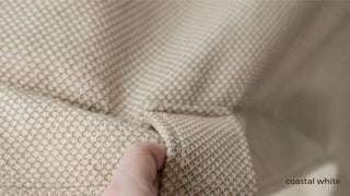
Request as much as you think you need. The difference between a swatch you dismiss immediately and one that surprises you in real light is often just the context. We recommend requesting your top three colors across the fabric quality you're considering or across two qualities if you're still deciding between Coastal Proof and Performance.
Once they arrive, test them properly:
Leave them outside at the time of day you use your terrace most. Because the morning light and afternoon light read very differently in Spain. Hold each swatch against the main surfaces it will sit next to: your floor tiles, your wall color and the frame of your sunlounger or lounge set. If you're choosing for a parasol, hold the swatch up against the sky. This is the view most people forget, and it changes everything. And if you're matching multiple products, lay all the swatches out together at the same time. The combination matters more than any single colour in isolation.