
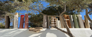
Not sure which colours work in the Spanish sun?
Discover how to build a warm, balanced palette that stays beautiful from morning coffee to late summer evenings.
Why choosing colour in Spain feels different
When we first started working on our own house in Sitges, we thought choosing colours would be easy. We had a clear idea of what we liked in the Netherlands: soft beiges, calm whites, natural tones. And a surprising contrast for some spice.
But once we saw those same samples under the Spanish sun… everything changed.
-
Whites suddenly looked too bright or even cold
-
Beiges turned yellow or flat
-
Contrasts felt much sharper than expected
We experienced the same challenge across everything:
-
Outdoor fabrics
-
Wall paint
-
Microcement floors and furniture
-
Tiles and stone
What looked subtle and balanced in Holland, felt loud or off in Spain.
That’s when we realised: Mediterranean light doesn’t just influence your space—it completely transforms colour.
What we’ve learned about Mediterranean outdoor living in Spain.
After working on many outdoor spaces across Sitges, Barcelona, Costa Brava and Costa Blanca, we’ve developed a simple way to approach colour that works in the Mediterranean climate.
Not based on trends, but on light, landscape and daily use.
Here’s how we guide our clients.
1. How Mediterranean light changes colour choices in Spain
The biggest difference with Northern Europe is the light.
-
The sky is brighter and whiter
-
The sun is stronger and more direct
-
Shadows are sharper
This means:
-
Light colours appear even lighter
-
Dark colours become heavier and more dominant
Perhaps try our rule:
Choose colours 1–2 shades warmer than you would in the Netherlands.
Examples:
-
Instead of pure white → go for chalk, sand or off-white
-
Instead of cool grey → choose warm grey or mushroom
2. How to choose colours for your outdoor space in Spain
In Spain, your environment already gives you the perfect colour palette.
Look around your outdoor space:
-
Walls: white, beige, terracotta, stone
-
Floors: tiles, microcement, wood
-
Nature: olive trees, palms, dry grass, flowers
-
Water: pool blue or sea tones
The best result comes from blending in, not standing out.
Good base colours can be:
-
Sand, linen, beige
-
Terracotta and soft clay
-
Olive, sage, dusty green
-
Warm greys and stone tones
3. Why tone-on-tone colours work best for mediterranean outdoor living
High contrast might look great on Pinterest, but during summer, in the Spanish heat it often feels too harsh.
Instead, we recommend a tone-on-tone palette as a base:
-
3 to 5 colours within the same colour family
-
Subtle differences in shade, not strong contrast
-
or a striped fabric but in tone with the environment
This creates:
-
Visual calm
-
A more luxurious feel
-
Less “visual heat” during hot days
Example palette: → visualiseren + fabric colour en links naar de kleur
4. How texture creates depth in custom outdoor cushions in Spain
If you keep colours calm, texture becomes key. Think of mixing:
-
Soft outdoor fabrics
-
Rough stone or tiles
-
Microcement finishes
-
Natural wood
-
Woven elements
Texture adds richness without making the space feel busy. For example use a weave or structure for your lounge cushions. Or add fringes and wooden frames to your parasol for subtle contrast. Add soft comfy shapes to your cushions. An other option is to combine soft tones in different fabrics. For example a salt colored waterproof fabric at your pool, with structured soft cushions for your lounge in warm white, pepper or nomad beige.
Visueel voorbeeld
5. How to add colour with parasols, cushions and outdoor accessories
Want to add personality? Do it in elements you can easily change.
-
decorative cushions
-
beachtowels
-
table clothes & plates
-
pots and lamps
Also keeps you flexible so you can easily change colours per season: high summer or autumn sun
fotos
-
Terracotta parasol met fringes
-
coastal white parasol with terra fringes and brown poof
-
Soft coral cushions
-
Olive green poof or sunlounge
-
Muted yellow cushions or beach towel
-
60x60 cm kussen
6. Choosing colours for pool terraces, sunbeds and south facing terraces.
Colour is not just about aesthetics, it also affects comfort.
-
Light colours reflect heat → cooler to sit on
-
Dark colours absorb heat → can get very warm or keep the warmth of the sun later the day during autumn or spring
Especially important for:
-
South-facing terraces
-
Poolside lounges
-
Sunbeds
7. Choosing the right outdoor fabric for the Spanish sun.
Colour and material always go together.
At Interior Nomad, we work with three fabric types:
-
COMFORT → with a soft textile, structure great match with warmer, natural tones
-
COASTAL PROOF → perfect for daily use and lots of sun. A soft but flat structure which can use a soft tone for an extra dimension.
-
PERFORMANCE (PVC coated) → good choice for the pool area or rental spaces available in both beige and white tones as in colors. The fabric can be chosen for a pool proof poof or a flexible baggy sunlounger. For these movable elements a terra or cactus green work perfect.
All 3 fabric qualities are ‘solution dyed’ . This means the colour is added into the fibre before weaving, making it highly colourfast in the sun.
Beeld casa A: lounge terra, sunlounge salmon, parasol nude
8. Common colour mistakes in Mediterranean Outdoor Living (and how to avoid them)
-
always check the color locally
-
in full sun and in the shade
-
look a few times during the day; different moment, different color
-
blend the surrounding colors and materials in your pallet
-
spice with different materials and shades
-
use contrast colors for movable items like decorative cushions, poofs, parasols etc
Start simple:
-
Choose a warm, natural base for different materials
-
Add 2 to 3 supporting tones according the environment
-
Finish and spice with movable accents
Next step:
-
Request free outdoor fabric samples or make an appointment in our LoungeLab